Topics in Part 4
- CSS Styling
- Adding an Application Icon
CSS Styling
In JavaFX you can style your user interface using Cascading Style Sheets (CSS). This is great! It’s never been as easy to customize the appearance of a Java application.
In this tutorial we will create a DarkTheme inspired by the Windows 8 Metro design. The css for the buttons is based on the blog post JMetro - Windows 8 Metro controls on Java by Pedro Duque Vieira.
Getting Familiar with CSS
If you want to style your JavaFX application you should have a basic understanding of CSS in general. A good place to start is this CSS tutorial.
For more JavaFX specific information about CSS:
- Skinning JavaFX Applications with CSS - Tutorial by Oracle
- JavaFX CSS Reference - Official Reference
Default JavaFX CSS
The default source for CSS styles in JavaFX 8 is a file called modena.css. This css file can be found in the Java FX jar file jfxrt.jar located in your Java folder under /jdk1.8.x/jre/lib/ext/jfxrt.jar.
Unzip the jfxrt.jar. You should find the modena.css under com/sun/javafx/scene/control/skin/modena/
This default style sheet is always applied to a JavaFX application. By adding a custom style sheet we can override the default styles of the modena.css.
Attaching CSS Style Sheets
Add the following CSS file called DarkTheme.css to the view package.
DarkTheme.css
.background {
    -fx-background-color: #1d1d1d;
}

.label {
    -fx-font-size: 11pt;
    -fx-font-family: "Segoe UI Semibold";
    -fx-text-fill: white;
    -fx-opacity: 0.6;
}

.label-bright {
    -fx-font-size: 11pt;
    -fx-font-family: "Segoe UI Semibold";
    -fx-text-fill: white;
    -fx-opacity: 1;
}

.label-header {
    -fx-font-size: 32pt;
    -fx-font-family: "Segoe UI Light";
    -fx-text-fill: white;
    -fx-opacity: 1;
}

.table-view {
    -fx-base: #1d1d1d;
    -fx-control-inner-background: #1d1d1d;
    -fx-background-color: #1d1d1d;
    -fx-table-cell-border-color: transparent;
    -fx-table-header-border-color: transparent;
    -fx-padding: 5;
}

.table-view .column-header-background {
    -fx-background-color: transparent;
}

.table-view .column-header, .table-view .filler {
    -fx-size: 35;
    -fx-border-width: 0 0 1 0;
    -fx-background-color: transparent;
    -fx-border-color:
        transparent
        transparent
        derive(-fx-base, 80%)
        transparent;
    -fx-border-insets: 0 10 1 0;
}

.table-view .column-header .label {
    -fx-font-size: 20pt;
    -fx-font-family: "Segoe UI Light";
    -fx-text-fill: white;
    -fx-alignment: center-left;
    -fx-opacity: 1;
}

.table-view:focused .table-row-cell:filled:focused:selected {
    -fx-background-color: -fx-focus-color;
}

.split-pane:horizontal > .split-pane-divider {
    -fx-border-color: transparent #1d1d1d transparent #1d1d1d;
    -fx-background-color: transparent, derive(#1d1d1d,20%);
}

.split-pane {
    -fx-padding: 1 0 0 0;
}

.menu-bar {
    -fx-background-color: derive(#1d1d1d,20%);
}

.context-menu {
    -fx-background-color: derive(#1d1d1d,50%);
}

.menu-bar .label {
    -fx-font-size: 14pt;
    -fx-font-family: "Segoe UI Light";
    -fx-text-fill: white;
    -fx-opacity: 0.9;
}

.menu .left-container {
	-fx-background-color: black;
}

.text-field {
    -fx-font-size: 12pt;
    -fx-font-family: "Segoe UI Semibold";
}

/*
 * Metro style Push Button
 * Author: Pedro Duque Vieira
 * http://pixelduke.wordpress.com/2012/10/23/jmetro-windows-8-controls-on-java/
 */
.button {
    -fx-padding: 5 22 5 22;
    -fx-border-color: #e2e2e2;
    -fx-border-width: 2;
    -fx-background-radius: 0;
    -fx-background-color: #1d1d1d;
    -fx-font-family: "Segoe UI", Helvetica, Arial, sans-serif;
    -fx-font-size: 11pt;
    -fx-text-fill: #d8d8d8;
    -fx-background-insets: 0 0 0 0, 0, 1, 2;
}

.button:hover {
    -fx-background-color: #3a3a3a;
}

.button:pressed, .button:default:hover:pressed {
  -fx-background-color: white;
  -fx-text-fill: #1d1d1d;
}

.button:focused {
    -fx-border-color: white, white;
    -fx-border-width: 1, 1;
    -fx-border-style: solid, segments(1, 1);
    -fx-border-radius: 0, 0;
    -fx-border-insets: 1 1 1 1, 0;
}

.button:disabled, .button:default:disabled {
    -fx-opacity: 0.4;
    -fx-background-color: #1d1d1d;
    -fx-text-fill: white;
}

.button:default {
    -fx-background-color: -fx-focus-color;
    -fx-text-fill: #ffffff;
}

.button:default:hover {
    -fx-background-color: derive(-fx-focus-color,30%);
}
We now need to attach the CSS to our Scene. We could do this programmatically in Java code, but we’ll use the Scene Builder to add it to our fxml files:
Attach CSS to RootLayout.fxml
-
Open the file
RootLayout.fxmlin Scene Builder. -
Select the root
BorderPanein the Hierarchy view. Under Properties group add theDarkTheme.cssfile as stylesheet.
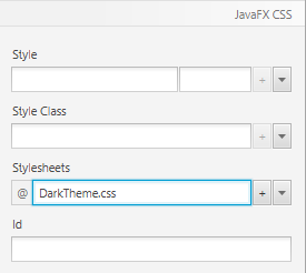
Attach CSS to PersonEditDialog.fxml
-
Open the file
PersonEditDialog.fxmlin Scene Builder. Select the rootAnchorPaneand chooseDarkTheme.cssin the Properties group as stylesheet. -
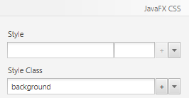
The background is still white, so add the Style Class
backgroundto the rootAnchorPane.
-
Select the OK button and choose Default Button in the Properties View. This will change its color and make this the default button when the enter key is pressed by the user.
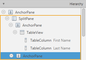
Attach CSS to PersonOverview.fxml
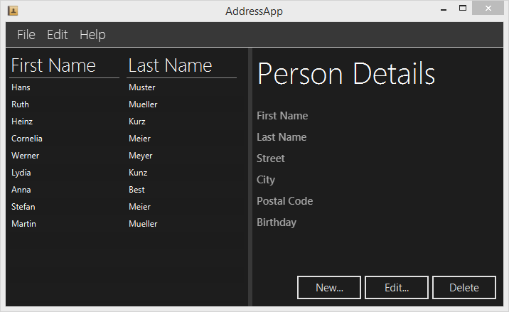
-
Open the file
PersonOverview.fxmlin Scene Builder. Select the rootAnchorPanein the Hierarchy group. Under properties add theDarkTheme.cssfile as stylesheet. -
You should already see some changes now: The table and the buttons are black. All class styles
.table-viewand.buttonfrommodena.cssapply to the table and buttons. Since we’ve redefined (and thus overridden) some of those styles in our custom CSS, the new styles are applied automatically. -
You might need to adjust the size of the buttons so that all text is displayed.
-
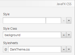
Select the right
AnchorPanethat is inside theSplitPane.
-
Go to the Properties group and select
backgroundas style class. The background should now turn black.
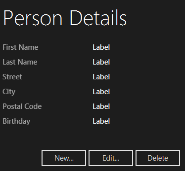
Labels with Different Style
Right now, all the labels on the right side have the same size. There are already some styles defined in the css file called .label-header and .label-bright that we’ll use to further style the labels.
-
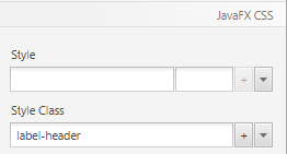
Select the Person Details label and add
label-headeras a Style Class.
-
To each label in the right column (where the actual person details are displayed), add the css Style Class
label-bright.
Adding an Application Icon
Right now our application just has the default icon in the title bar and taks bar:
It looks much nicer with a custom icon:
The Icon File
A possible place to get free icons is Icon Finder. I downloaded a little address book icon.
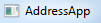
Create a (normal) folder inside your AddressApp project called resources and a subfolder called images in it. Put the icon of your choice inside the images folder. Your folder structure should look something like this now:
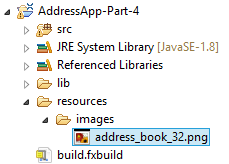
Set Icon to Scene
To set the icon for our scene add the following line to the start(...) method in MainApp.java
MainApp.java
this.primaryStage.getIcons().add(new Image("file:resources/images/address_book_32.png"));
The whole start(...) method should look something like this now:
public void start(Stage primaryStage) {
    this.primaryStage = primaryStage;
    this.primaryStage.setTitle("AddressApp");

    // Set the application icon.
    this.primaryStage.getIcons().add(new Image("file:resources/images/address_book_32.png"));

    initRootLayout();

    showPersonOverview();
}
You can also add an icon to the stage of the person edit dialog, of course.
What’s Next?
In Tutorial Part 5 we will add XML storage for our data.