By default, HTML elements are arranged in two ways:
Block elements always start on a new line. Examples of block elements are <div>, <h1>, <p>, and <li>.
Inline Elements are displayed in a line. Examples of inline elements are <span>, <a>, <strong>, <em>, and <img>.
However, these two options are not enough to create a proper layout for a web page.
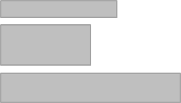
Most websites either have a layout with two columns …
… or they have a layout with three columns.
To create a layout like this without a CSS framework like Bootstrap would be quite a challenge. With Bootstrap it gets much easier.
In addition, the layout in Bootstrap is automatically adjusted to the screen size (so-called Responsive Layout). For example, we can specify that the columns should be displayed below each other on small screens, because they would not fit if displayed horizontally.
The Bootstrap Grid
Bootstrap uses a 12-column grid system for the layout (see documentation of the Bootstrap grid). A grid can be thought of as an invisible table with twelve columns.

We define our columns by specifying how many colums out of the possible 12 we would like to use.
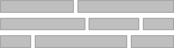
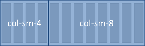
Example for a Two-Column Layout
In this example, we define a left column with a width of 4 and a right column with a width of 8. On the left we could have a navigation while on the right we would put the page’s content.
In the HTML code of this layout would look like the following:
<div class="container">
  <div class="row">
    <div class="col-sm-4">
      Content of the left column.
    </div>
    <div class="col-sm-8">
      Content of the right column.
    </div>
  </div>
</div>
- The grid should always be in a
<div>with thecontainerclass. (To use a full width container, spanning the entire width of the viewport use thecontainer-fluidclass.) - Inside the container is a
<div>with classrow. With this we define a row in the grid. - Inside a row we define the columns with the various
colclasses.
Screen Sizes
Every Bootstrap column class contains an indication of the screen size. There are four screen sizes:
col- Column for extra small devices (smartphones, lower than 576px)col-sm- Column for small devices (smartphones, 576px and up)col-md- Column for medium devices (tablets, 768px and up)col-lg- Column for large devices (desktops, 992px and up)col-xl- Column for extra large devices (large desktops, 1200px and up)
Specifying col-sm-4 in our example above thus means, that a column of width 4 will be displayed on screens that have at least the size of a tablet.
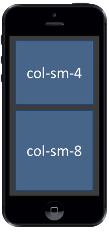
On all screens that are smaller, the columns will automatically be stacked vertically.
This is how our example for a two-column layout would look like on a smartphone:
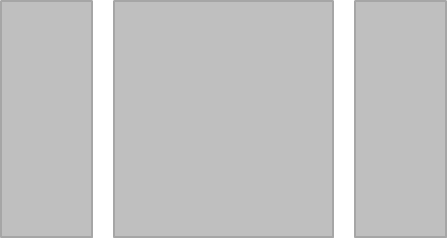
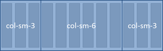
Example for a Three-Column Layout
In this example, we define three columns.
In HTML code this layout would look like this:
<div class="container">
  <div class="row">
    <div class="col-sm-3">
      Content of the left column.
    </div>
    <div class="col-sm-6">
      Content of the middle column.
    </div>
    <div class="col-sm-3">
      Content of the right column.
    </div>
  </div>
</div>
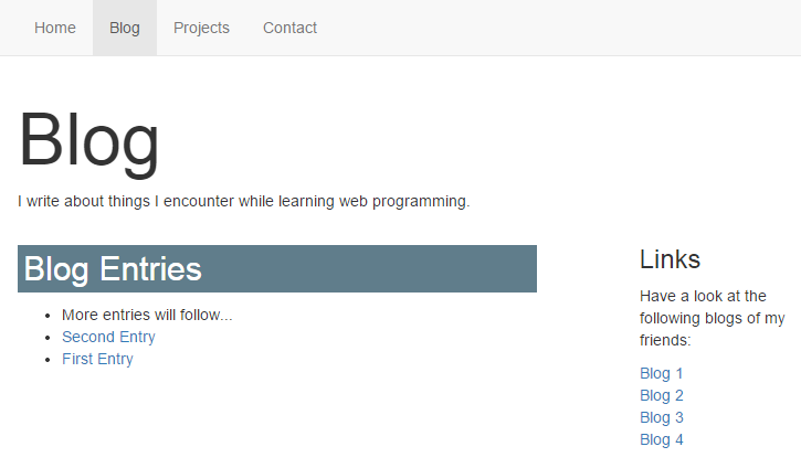
Applying it to our Portfolio Blog
In the HTML & CSS Tutorial we developed a portfolio with a blog page. The following example shows a two-column layout for the blog page. The left column contains the list of blog entries. In the right column, we now have some space for things like a list of links.
blog/index.html
<div class="container">
  <h1 class="title">Blog</h1>
  <p>I write about things I encounter while learning web programming.</p>

  <div class="row">
    <div class="col-sm-8">
      <h2>Blog Entries</h2>
      <ul>
        <li>More entries will follow...</li>
        <li><a href="second-entry/">Second Entry</a></li>
        <li><a href="first-entry/">First Entry</a></li>
      </ul>
    </div>

    <div class="col-sm-3 offset-sm-1">
      <h3>Links</h3>
        <p>
          Have a look at the following blogs of my friends:
        </p>
        <ul class="list-unstyled">
          <li><a href="#">Blog 1</a></li>
          <li><a href="#">Blog 2</a></li>
          <li><a href="#">Blog 3</a></li>
          <li><a href="#">Blog 4</a></li>
        </ul>
    </div>
  </div>
</div>
Explanations
- In the right column I’ve added a second CSS class called
offset-sm-1. This causes the column to be moved one position to the right. Thus we get a slightly larger distance between the two columns. - Test the layout by resizing your browser window.
- The class
list-unstyledremoves the bullet points of the list items (see Bootstrap Lists).
More Infos on Bootstrap Layout
Read the section about the Grid System in the Bootstrap documentation.
An extensive and very good explanation about how the Bootstrap grid system works can be found in How the Bootstrap 4 Grid Works.