So far we have programmed all HTML and CSS from scratch. Our web portfolio project already has a few HTML pages with some content, a navigation and some styling.
To manually evolve our project to a complete and modern web presence would mean a large amount of work! Here is a list of some important tasks that we would have to deal with (do not worry, there is a solution!):
- Customize font and font sizes for all headings and sections.
- Beautifully design buttons, text boxes, etc. (the browser defaults look a bit outdated).
- Define margins and position elements on the page (very difficult).
- Define a consistent style for all different browsers so they show about the same thing.
- Optimize the web pages for different screen sizes (mobile, tablet and desktop).
- And more…
Fortunately, we are not alone with these tasks – this applies more or less to all web designers. Since it hardly makes sense for all to solve the same tasks over and over again, so-called frameworks were developed that make this job a lot easier.
The best known of these frameworks is Bootstrap, developed by Twitter. The Bootstrap framework is a tremendous help for us as web developers. Step-by-step we will discover what we can do with Bootstrap. Here is some taste of the effect Bootstrap could have on the styling of our project:
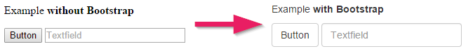
With Bootstrap the elements don’t only look better, they are also consistent across different browsers.
Using Bootstrap
Documentation
The official Bootstrap documentation is the best place to learn what’s possible. It contains a lot of examples that you can copy and paste into your website. You should have this website open very frequently!
Linking to the Bootstrap CSS
The most important part of Bootstrap consists of a large CSS file. For more complex elements there is also a JavaScript file. However, for the moment we will only use the CSS file.
Now let’s integrate the Bootstrap CSS in our HTML pages.
-
Open the Bootstrap website. You will find that there are several ways to download Bootstrap. Instead of downloading Bootstrap we will use the Bootstrap CDN. We only need to specify the location of the CSS file in our HTML. It will then be downloaded directly from the CDN servers every time our website is accessed. CDN servers are servers that are located all over the world so that they can deliver a file very quickly.
-
From the BootstrapCDN section copy the first line with the
linkelement. -
Insert the
linkelement into your HTML pages. It is important that you place the reference to the Bootstrap CSS above thelinkelement of themain.cssfile. This enables us to override CSS rules from the Bootstrap CSS in our own CSS. -
Copy the three rows for JavaScript: JS, Popper.js, and jQuery.
-
Insert the JavaScript references at the end of the body section in your HTML.
That’s how your HTML files should look like (maybe with a newer version and a few “integrity” numbers:
index.html
<html>
  <head>
    <meta charset="utf-8">
    <link rel="stylesheet" href="https://stackpath.bootstrapcdn.com/bootstrap/4.1.3/css/bootstrap.min.css">

    <link rel="stylesheet" href="/main.css">
    <title>Web Portfolio von Marco</title>
  </head>
    <body>
      <!-- Here is some website content -->

      <script src="https://code.jquery.com/jquery-3.3.1.slim.min.js"></script>
      <script src="https://cdnjs.cloudflare.com/ajax/libs/popper.js/1.14.3/umd/popper.min.js"></script>
      <script src="https://stackpath.bootstrapcdn.com/bootstrap/4.1.3/js/bootstrap.min.js"></script>
    </body>
</html>
How does Bootstrap Work?
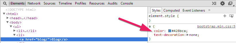
Some styles from the Bootstrap CSS are applied directly to HTML elements. If we look, for example, at a link in Chrome DevTools, we see how through the Bootstrap CSS the link color was changed and the underscore was removed with text-decoration.
Such styling is automatically applied. But a lot of Bootstrap styles require that we add specific CSS classes to elements, as we will see next.
Using Bootstrap Classes
As an example, let’s look at how the text alignment can be changed using Bootstrap. In the Bootstrap documentation under Alignment classes you can find instructions on text alignment.
Let’s say we want to center the h2 title. We can do this by adding the text-center class as follows:
<h2 class="text-center">Welcome!</h2>
Our h1 title already has a class attribute. If we want to center this item, we can add text-center as a second class. Multiple CSS classes are always separated by blank spaces.
<h1 class="title text-center">Web Portfolio of Marco</h1>
But what if we want to center a bigger part of our website? It would be tedious if we had to add a text-center for each element. It is thus possible that we can add it to a parent element. Many CSS rules are automatically passed on to all sub-elements.
We could even add a text-center class to the body element. This would center everything on our page. If you just want to center a part of the page, it is common to use a <div> element.
div Elements
With the <div> element other elements are grouped into a block. With Bootstrap <div> elements are used quite often to apply styles to an entire section of the page.
An essential CSS class in Bootstrap is container. The container automatically adjusts its content to the width of the page and guarantees a reasonable margin to the edges. You should always have a <div> element with the container class in your page. Read the Bootstrap documentation for a description of containers.
We will now pack the main content of our home page between a <div class="container"> and the closing </div>. (We will deal with the navigation separately below.)
The <body> part of your page should look like this (pay attention to indentation of elements so that your code stays readable):
index.html
<body>
  <ul>
    <li><a href="/">Home</a></li>
    <li><a href="/blog/">Blog</a></li>
    <li><a href="/projekte/">Projekte</a></li>
    <li><a href="/kontakt/">Kontakt</a></li>
  </ul>

  <div class="container">
    <h1 class="title">Web Portfolio of Marco</h1>

    <h2>Welcome!</h2>

    <p>Thanks for stopping by.</p>

    <p>Please have a look around. In the blog section I document my experiences in programming. You may also look at my web projects. Have Fun.</p>

    <img src="marco.jpg" alt="Picture of me">

    <p>Marco :-)</p>
  </div>
</body>
The browser always displays <div> elements on a new line. Such elements, because they claim all available width, are called block elements.
span Elements
In contrast to <div> elements, a <span> element does not start on a new line. A <span> element is only as wide as its content. Such elements are called inline elements.
Here is an example of how we could use a span element:
I would like to <span class="text-warning">highlight those words</span>.
Navigation with Bootstrap
Finally, we want to make the navigation more beautiful with the help of Bootstrap. In the Bootstrap documentation a Navbar is described. However, the example is very complex and includes menus, text boxes and buttons. We’ll implement a simpler version.
Copy the following code for your navigation:
index.html
<nav class="navbar navbar-expand-lg navbar-light bg-light">
  <div class="container">
    <button class="navbar-toggler" type="button" data-toggle="collapse" data-target="#navbarMenu">
      <span class="navbar-toggler-icon"></span>
    </button>
    <div class="collapse navbar-collapse" id="navbarMenu">
      <ul class="navbar-nav">
        <li><a class="nav-link active" href="/">Home</a></li>
        <li><a class="nav-link" href="/blog/">Blog</a></li>
        <li><a class="nav-link" href="/projects/">Projects</a></li>
        <li><a class="nav-link" href="/contact/">Contact</a></li>
      </ul>
    </div>
  </div>
</nav>
Explanations
-
The outer
navelement withnavbaras class creates the bar at the top of the page. Anavelement is the same as adivexcept that we give a hint to seach engines that this is a navigation. -
The next
divwith the classcontaineris responsible for the left and right margins to aligns the navigation in the same way as the content of our website. Note always the corresponding closing</div>tag. -
The
buttonelement with the classnavbar-toggleris the button on the mobile view to expand the menu. To test this make the browser window small. -
Compared to our simple first navigation we have added a
nav-linkclass to each link. This applies the correct styling to the links. -
Note: The active navigation element has an additional
activeclass. This makes the active element stick out.
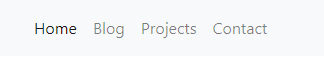
And this is how it looks like:
Dark Version
There is a dark alternative for the navigation:
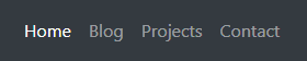
To activate the alternative style, replace the navbar-light with navbar-dark and bg-light with bg-dark.
Optimizing for Mobile
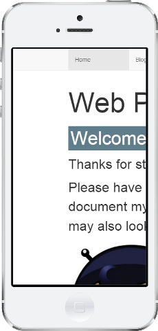
With Bootstrap and the new navigation the website looks already quite appealing in a desktop browser. Try opening it on a mobile phone (you will need to publish it online to do this).
You will notice that the page either doesn’t fit the screen or the navigation is displayed too small.
With a meta info inside head we can tell the mobile browsers to properly scale the page.
<head>
  <meta charset="utf-8">
  <meta name="viewport" content="width=device-width, initial-scale=1">
  <link rel="stylesheet" href="https://stackpath.bootstrapcdn.com/bootstrap/4.1.3/css/bootstrap.min.css">
  <link rel="stylesheet" href="main.css">
  <title>Web Portfolio von Marco</title>
</head>
It should now look something like this:

Bootstrap was designed so that it works well on mobile screens. In the screenshot above you can see how the navigation is automatically displayed vertically when the width of the screen is too small. If you’re not using a mobile phone you can also simulate this by simply resizing your browser window.
Web design that is optimized for different screen sizes is called responsive web design.
</body> tag.
Bootstrap and Navigation in all Pages
So far, we have inserted Bootstrap and the navigation only in our home page. The goal, of course, is that they are included in all pages.
With small adjustments we can copy the code from the home page to all other pages (blog, blog entries, contact, etc.).
1. Insert Viewport and Bootstrap CSS
Copy the line with the viewport and the line with the Bootstrap CSS from the head area of the home page and paste it in all other sites.
<meta name="viewport" content="width=device-width, initial-scale=1">
<link rel="stylesheet" href="https://stackpath.bootstrapcdn.com/bootstrap/4.1.3/css/bootstrap.min.css">
2. Insert JavaScript
Copy the three JavaScript references from the end of the body section into every other page:
<body>
  <!-- Hier steht irgend ein Inhalt -->

  <script src="https://code.jquery.com/jquery-3.3.1.slim.min.js"></script>
  <script src="https://cdnjs.cloudflare.com/ajax/libs/popper.js/1.14.3/umd/popper.min.js"></script>
  <script src="https://stackpath.bootstrapcdn.com/bootstrap/4.1.3/js/bootstrap.min.js"></script>
</body>
3. Insert Navigation
Copy the entire navigation of the home page and paste it into all the other pages. Make sure that you add the active class to the current li element.
<nav class="navbar navbar-expand-lg navbar-light bg-light">
  <div class="container">
    <button class="navbar-toggler" type="button" data-toggle="collapse" data-target="#navbarMenu">
      <span class="navbar-toggler-icon"></span>
    </button>
    <div class="collapse navbar-collapse" id="navbarMenu">
      <ul class="navbar-nav">
        <li><a class="nav-link" href="/">Home</a></li>
        <li><a class="nav-link active" href="/blog/">Blog</a></li>
        <li><a class="nav-link" href="/projects/">Projects</a></li>
        <li><a class="nav-link" href="/contact/">Contact</a></li>
      </ul>
    </div>
  </div>
</nav>
4. Insert Container div
When you open some pages in the browser you will notice that the margins are not correct. To fix this we need the entire content (everything below the navigation) to be surrounded by a <div>. This <div> must have the container class. Put containers in all the pages that don’t have it yet.
[... navigation ...]

<div class="container">
  [... content ...]
</div>
4. Testing and Cleanup
It’s very important that you navigate through all pages and carefully test all the links!
Then look at your code and make sure that the HTML is clean. Each time an HTML tag is opened the next line should be indented. The closing tag is then moved to the left again.
What’s next?
→ Read about the Next Steps.